CARE SETTINGS
Care Home Wall Murals: What Dementia-Friendly Design Actually Asks For
Murals can help residents find their way and start conversations — or confuse them. What dementia-friendly design guidance actually asks of a printed wall.
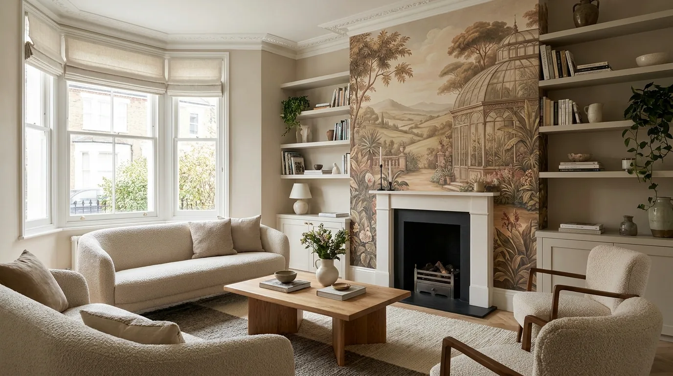
Care homes are one of the most common enquiries we get for printed walls, and one of the few where the design brief is genuinely a clinical question as much as a decorative one. A corridor mural in a dementia unit is not wallpaper with a nicer picture on it — it changes how a resident reads the space they are walking through. Done with the guidance in mind it helps with orientation and gives staff and families something to talk about. Done badly it adds confusion to a building that already has too much of it.
Here is what the published dementia-design guidance consistently asks for, and how it translates into a wall we would actually print.
Contrast is a wayfinding tool, not a style choice
The single most repeated point in dementia-friendly design guidance is contrast. Ageing eyes lose contrast sensitivity long before they lose acuity, so a door, a handrail or a lounge entrance that only differs from the wall by a shade of beige can effectively disappear. Design guidance for care settings commonly recommends a meaningful contrast step — often expressed as at least 20 points of light reflectance value — between a feature wall and the surface around it, and dark lettering on a light ground for signage.
That is a useful constraint for a mural, because it tells you where the strong colour belongs. Put the contrast at the decision points: the bay a resident needs to find, the turn in the corridor, the door to the garden. Keep the long runs of wall between them calmer. A mural that is loud everywhere carries no information.
Avoid patterns that the eye has to work out
Strong geometric repeats, high-contrast speckles and busy small-scale patterning are widely advised against in dementia environments — they can distort the perceived shape of a room, and dark patches on a floor or wall can be misread as holes, dirt or water. The same caution applies to anything glossy: reflections and glare are a known source of confusion, which is one reason matt finishes are the standard recommendation.
- Yes: open, calm scenes with clear depth cues, soft gradients, large recognisable shapes.
- No: repeating geometry, dense small motifs, near-black blocks on a light wall, anything that reads as a hole or a puddle.
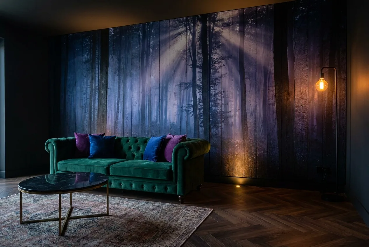
- Careful: photoreal scenes with implied depth. A corridor-end mural of a path leading into a wood is a genuinely debated idea — some residents read it as somewhere to walk into.
Reminiscence works when it is local and real
Reminiscence décor — imagery drawn from the decades a resident remembers most clearly — is the strongest argument for a mural rather than a coat of paint. It gives staff, families and visitors an obvious thing to talk about, and it makes a lounge look like somewhere a person has lived rather than a waiting area.
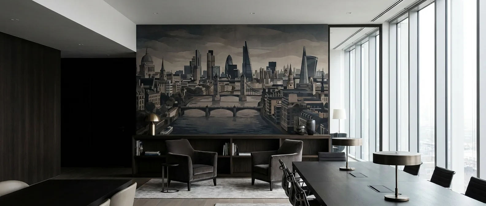
The version that works is specific: the local high street, the pier, the football ground, the shop fronts and vehicles of the right decade. Generic nostalgia clip art does none of that. If your home has residents from one area, that area is the mural. We regularly print from archive photographs and family images — a scan good enough to print large is usually the only technical hurdle, and we will tell you before you commit if a file will not hold up at wall scale.
The honest caveat: a mural is not therapy
There is real, reasonable criticism in the sector of murals being sold to care homes as though they were an intervention. They are not. A painted-on bus stop does not manage walking-with-purpose, and a mural of a front door does not replace staffing or a garden that residents can actually use. Some approaches — false doors, trompe-l'œil scenes intended to stop someone leaving — sit in genuinely contested ethical territory and should be a decision your clinical lead makes, not your decorator.
What a mural reliably does is make a space legible and pleasant. That is worth doing on its own terms, and it is what we will design for.
Why printing directly onto the wall suits a care setting
The practical constraints in a care home are unusual: the building never closes, corridors are also fire escape routes, and residents cannot easily be moved out for two days. Direct UV printing fits that better than most finishes.
- It cures as it prints. There is no drying time and very little odour, so a corridor is back in use the same day rather than sealed off overnight.
- Low emissions are certifiable. UV LED ink sets used for interior work are the ones vendors put through independent low-emission testing — GREENGUARD Gold is the usual certification — precisely because they go into schools and healthcare buildings. If your infection-control or estates team wants documentation, ask us and we will supply it.
- Nothing to peel. The ink cures into the wall surface rather